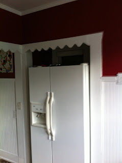
It is not often that I don't see the finished product of a room but with the craziness of last year it happened a few times. So you can imagine my delight when I opened an e-mail from a client with some before and afters of a kitchen I worked on this past summer. While the kitchen was cute before at first glance, upon closer look it needed a lot of TLC....
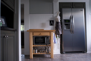
Here are the afters, I can't wait to see it in person!
Thanks Kate for the pictures!


20 comments:
This is gorgeous! I love what you did with the space. That's an amazing before and after! :) Hope you're doing well!
oh wow! I agree the before looks cute, but the after is ah-mazing!!! Loving the clean fresh look. great work.
WOW! Amazing job with it. What I wouldn't give for white cabinets...someday.
what a HUGE difference! Like a whole new room.
Marianne, you just gave me the PERFECT example picture to give a fabricator that I've been speaking to about this very very thing. LOVE YOU!
I have a very serious important question...where is the microwave? I can't decide where mine would go because it would be right in the middle of those shelves (over the oven).
the afters are INSANE! love it!!!
hope you and your boys are doing well.....
That's a great makeover! It doesn't even look like the same space. :)
Now those are some pretty special 'after' photos. I absolutely love it! I really love the look of those steel cabinets and the glossy subway tiles. Would you mind sharing the paint color behind the shelving? I love it!
Wow! Amazing transformation. I'm certain your client probably spends more time in the new kitchen...too fabulous to not cook in and enjoy!
Wow! She must love working in that space now. Thanks for sharing.
FABULOUS!!!!!!!!! Girlie, you are a genius. I'm sure your clients are thrilled and sing your praises every time they walk in their new kitchen.
Beyond amazing! Love it!
Wow- what a difference! I love that it still has a rustic vibe happening, but it's much more refined. Love it.
Gorgeous makeover!
Thanks for posting this Marianne! We love how your vision turned out. And to answer a question above - the microwave is tucked in the island. It doesn't take up much needed counter space and stays fairly hidden that way :)
Oh my gosh - beautiful! You have such an eye. I'm sure the clients are over-the-moon happy.
Love the shelves and subway tiles and all the grey... great transformation!
It is beautiful!!!!!
I love your design on this kitchen *and* I am smitten with that apron hanging by the refrigerator. Was that your doing, too?
What a difference!! LOVE how it looks now.
Post a Comment