 The eyes of the LORD are on those who fear him, on those whose hope is in his unfailing love. Psalm 33:18

Sunday, January 31, 2010
Quiet Time
The eyes of the LORD are on those who fear him, on those whose hope is in his unfailing love. Psalm 33:18
Friday, January 29, 2010
Like It's 1999
Last time I was home my parents gave me a bunch of old magazines, I have enjoyed looking through designs of previous decades. Loving this house from Traditional Home, May 1999...


 A little hardware goes a long way...


 Even though this was shot 10+ years ago, designer John Barman's home looks like it could be in a magazine today.


 A little hardware goes a long way...

 Even though this was shot 10+ years ago, designer John Barman's home looks like it could be in a magazine today.
Thursday, January 28, 2010
My New Obsession, I Mean Inspiration
You will have to forgive me because I am copying Peppermint Bliss from earlier this week, but I couldn't help myself, I am in love.
 Even though I had seen Katie Ridder's work several times before, I did not realize all of it was hers. Then I came across this post highlighting the designer and I was marking every picture. Her work is like a breath of fresh air, unique, colorful, bold yet pretty. But what would you expect from the designer behind the prettiest logo I think I have ever seen....

 What if I had a kitchen that could hold a ladder and I don't mean my dinky metal ladder....yes, what if....

 Notice the light and ceiling in this picture, I also love what she does with shades....

 How cool is this room for children, love the mini plaid chairs....

 When you have a chance to sit and study you really need to look at Katie's website, I wish I could print all her work and put it in a magazine to study page by page.
All images Katie Ridder found via Peppermint Bliss.
 Even though I had seen Katie Ridder's work several times before, I did not realize all of it was hers. Then I came across this post highlighting the designer and I was marking every picture. Her work is like a breath of fresh air, unique, colorful, bold yet pretty. But what would you expect from the designer behind the prettiest logo I think I have ever seen....
 What if I had a kitchen that could hold a ladder and I don't mean my dinky metal ladder....yes, what if....
 Notice the light and ceiling in this picture, I also love what she does with shades....

 How cool is this room for children, love the mini plaid chairs....
 When you have a chance to sit and study you really need to look at Katie's website, I wish I could print all her work and put it in a magazine to study page by page.
All images Katie Ridder found via Peppermint Bliss.
Wednesday, January 27, 2010


Busy Days & Mondays
Why is it on busy days and Mondays it is hard for me to post anything but pictures of bedrooms?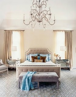
 Images ???? Help! I believe I saw these on Noodle and Boof and From The Right Bank but I can't place it....

 Images ???? Help! I believe I saw these on Noodle and Boof and From The Right Bank but I can't place it....
Tuesday, January 26, 2010
My Colors Are Blush And Bashful
Shelby: "My colors are blush and bashful".
M''Lynn: "Her colors are pink and pink."
Shelby: "My colors are blush and bashful Momma."
M'Lynn: "How pretentious is this wedding to going to get I ask you?"
Shelby: "My colors are blush and bashful, I have chosen two shades of pink, one is much deeper than the other."
I don't know if it was a wedding this past weekend, or talking about color a lot, or the fact that today is my best friends birthday and I can hear her reciting Steel Maganolias in mind as I type this but this quote has been in my head. So I thought it was only fitting to have a pink day since it is not a color I do that much... Image Here.
 Image Here.
 Image Here.


Image Here and Here.
 Image Here.
 Image Here.
 Image Here.
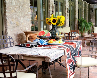
I had to throw in a blue one for the birthday girl, Happy Birthday Dew!
 Image Here.
If you have not seen Steel Magnolias you really must.
M''Lynn: "Her colors are pink and pink."
Shelby: "My colors are blush and bashful Momma."
M'Lynn: "How pretentious is this wedding to going to get I ask you?"
Shelby: "My colors are blush and bashful, I have chosen two shades of pink, one is much deeper than the other."
I don't know if it was a wedding this past weekend, or talking about color a lot, or the fact that today is my best friends birthday and I can hear her reciting Steel Maganolias in mind as I type this but this quote has been in my head. So I thought it was only fitting to have a pink day since it is not a color I do that much...
 Image Here.
 Image Here.
 Image Here.

Image Here and Here.
 Image Here.
 Image Here.
 Image Here.
I had to throw in a blue one for the birthday girl, Happy Birthday Dew!
 Image Here.
If you have not seen Steel Magnolias you really must.
Monday, January 25, 2010

Coming or Going
There are a lot of things I wished this house had, but definitely towards the top of the list would be either a foyer or mudroom.


 Oh well, time to stop daydreaming and get back to work in my office....
 All images including my imaginary office Martha Stewart.


 Oh well, time to stop daydreaming and get back to work in my office....
 All images including my imaginary office Martha Stewart.
Sunday, January 24, 2010
Quiet Time- Blessed Are
 I love Matthew Chapter 5, it always seems to be relevant to what is going on around us.
Blessed are the poor in spirit,
for theirs is the kingdom of heaven.
Blessed are those who mourn,
for they will be comforted.
Blessed are the meek,
for they will inherit the earth.
Blessed are those who hunger and thirst for righteousness,
for they will be filled.
Blessed are the merciful,
for they will be shown mercy.
Blessed are the pure in heart,
for they will see God.
Blessed are the peacemakers,
for they will be called sons of God.
Blessed are those who are persecuted because of righteousness,
for theirs is the kingdom of heaven. - Matthew 5:3-10
Image Here.
Friday, January 22, 2010
A Happy Home
Did you see this house on Hill Country House? Not exactly my style but it makes me happy.


 For more on Jane McGarry's home visit D Magazine


 For more on Jane McGarry's home visit D Magazine
Thursday, January 21, 2010
My Favorite Paint & Opinions Needed
I can already tell this is going to be a random post...I get asked a lot about paint colors and I plan on doing a "favorite colors" post with several of my favorites. However, there is one color that I recommend over and over (and I try not to). It is Restoration Hardware's Silver Sage. Sometimes it is blue, sometimes it is green, sometimes gray. I have it in my office but that is such a disaster area right now I can't show a picture.
 Anyhoo, the reason I am mentioning this is because when I would recommend it to clients I would tell them to go to the store to look at on the walls, you could see it in all different lights. Then one day recently a fabulous client called me and said, "Have you seen the wall color in RH?!?!?!?" Since she knows me so well she knew I would be as obsessed as she was. She was correct...
 I believe it is from the Slate collection, but I will confirm.... It is so pretty.
 I know you are surprised that a gray shade isn't my #1 favorite paint color. So moving right along, I do not have my new logo yet and I am sure things will change when I do get it but for now I need some opinions. Do you like the gray background better....
 or do you prefer white? And what about grid lines like below? Too much? Helpful to the eye?
 I think there is something to be said for both, I would love to hear what you think.
Thanks Laurie for the paint tip!!!!
Subscribe to:
Posts (Atom)